Assignment Five: Your Choice, Part One

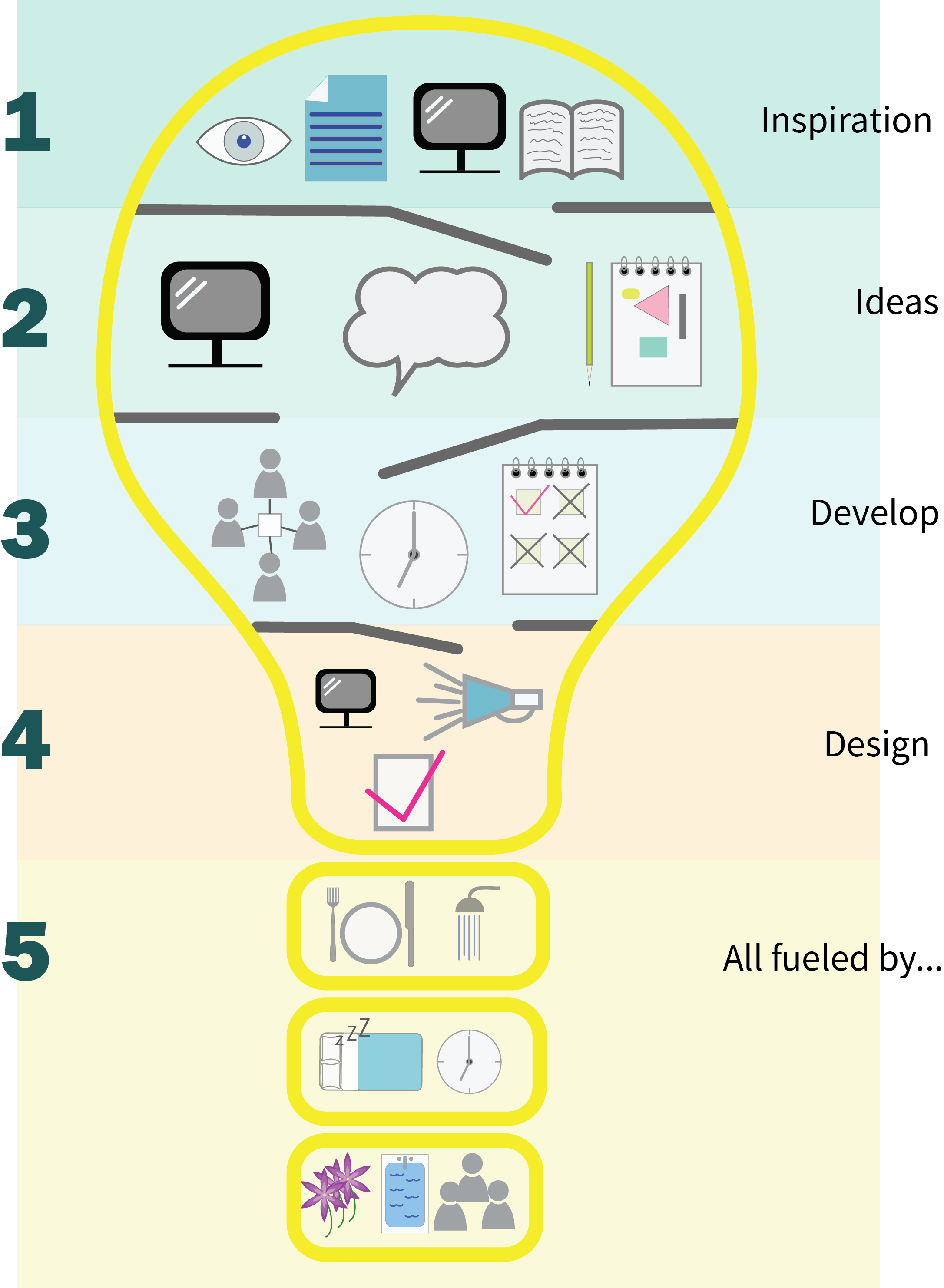
Assignment Five: Your Choice, Part One – Idea Development

Brief 1: Book Design

Penguin Books have asked you to design anew house style for a collection of books on design for children and young people. They are starting with three titles: Colour, Typography and Photographs. Produce three covers – front, back and spine. The designs need to be recognisable as a series and at the same time be appreciated for their individual merits. The book dimensions are 190mm wide by 225mm high.

In addition they have asked you to produce the one on Typography, called A is for…Create an introductory chapter of at least four pages.


I started by defining the brief a little further. Children and Young People is a very broad market and it is unlikely a design for five years olds will work for fifteen year olds. I decided the market would be primarily Young Adult (defined as 12 – 18yrs; Young Adult Library Services).

I had already done some background research on Penguin Books, and having read ‘Penguin by Design,’(Baines & Pearson, 2005) I felt like I had plenty of scope for developing the designs. While they needed a degree of consistency, the cover designs could draw on a range of influences. Although Penguin is mostly associated with orange spines, it has used patterns and other colours so this didn’t feel too restrictive.

I then did my usual in terms of sketching ideas and thinking about the themes I might use to develop the designs.

I was a bit put off by the fact that the Typography book seemed to have a double title – both ‘Typography’ and ‘A is for…’ so in my sketches I played with some examples where they all had a title. But this also seemed inconsistent, why would you have a book on colour called ‘C is for…’ when the one on typography is ‘A is for…’? I was also a bit worried that the title might locate it in a much younger age group and could therefore be in tension with the age group I had chosen to work with. It seemed to me that this meant the cover needed to be eye catching enough to be taken off the shelf and explored.

During Section Four I found three books on typography that were both helpful and enjoyable:

  • Typography Workbook (Samara, 2004)
  • Playing with Type (McCormick, 2013)
  • How to Draw Type and Influence People (Hyndman, 2017)

The two activity books were particularly good for engaging me and were a bit more playful than some of the other resources I had found, which seemed to get very technical very quickly and I found a bit daunting as a non-specialist. I decided I would take a similar approach to encourage young readers to play with typography. I did a bit more research and found that Penguin do produce activity books so it would be in keeping with the brief.

I did more research around typography books for young people and found very little, apart from the truly delightful ‘Serif Fairy’ (Siegfried & Mann, 2007) I broadened the research to graphic design and found a few more titles, but not many – definitely a gap in the market!

Layout examples:

  • Typography Workbook – 230mm x 230mm, 3 column grid
  • Penguin by Design – 185mm x 220mm, 3-column grid
  • Playing with Type – 235mm x 235 mm, mainly 2 column grid
  • How to Draw Type… – 270mm x 230mm, layout is varied – single column to three
  • Graphic Design for Kids – 210mm x 230mm, two column grid

This seemed to imply that the dimensions I was working with were narrower than the other activity books I had seen. A challenge, but hopefully not insurmountable!

References:

Baines, P., & Pearson, D. (2005). Penguin by design: a cover story 1935-2005: Penguin Press.

Hyndman, S. (2017). How to Draw Type and Influence People: an activity book. London: Laurence King Publishing Ltd.

McCormick, L. (2013). Playing with Type: 50 graphic experiments for exploring typographic design principles. Beverley, MA: Rockport Publishers.

Samara, T. (2004). Typography workbook: a real-world guide to using type in graphic design: Rockport Publishers.

Siegfried, R., & Mann, J. (2007). The Serif Fairy. New York: Mark Batty Publisher.


Exercise: Birthday List

Birthday planner for the month of january

Exercise: Birthday List (Graphic Design One, pg113)

Make a birthday list poster to keep on your wall. It is likely to be there for a while so it needs to look good. Start by collecting all the birthdays of your friends and family. You’ll need their name and birth date, to decide whether or not you buy them presents or just send a card, text message or email.


I’m not sure I entirely got the point of this exercise. I think this is partly because I tend not to use these sorts of things, so I had trouble getting past the ‘I’d just use an app’ thought! I started with a few sketches and looking online at other examples. The online research suggests this is seen as predominantly a female or young children market so the designs very much reflect this. Lots of bright colours, cupcakes, dinosaurs and stickers.

After making a few sketches, primarily to think about layout, I decided I would work on a perpetual version that could be downloaded as a PDF. It would have a hole in one corner to put a loop through for hanging, and each one can then be recycled after use. I wouldn’t put the month on but leave a space for the user to fill it in themselves.

I also decided I would use a pastel type palette, with an informal feel for everyday use. In terms of the information to include I decided on:

  • Date
  • Name
  • Card
  • Phone call
  • Present
  • Text
  • Make a cake

I created a landscape grid and added balloons and bunting.

Birthday planner for the month of january

Birthday list design

In terms of the need to contain certain information I think the design works well and it could easily go on a pinboard, fridge door or hang from a kitchen hook. The design is probably not the most inspiring in the world because of my feelings about the task and the nature of the output. I was definitely more engaged with the infographic, which is useful learning in terms of how I might deal with a design task that doesn’t excite me in future.

Rework

My tutor was right when he suggested this had gone clip art in design, and that was because I didn’t care about it and couldn’t find a way in to the exercise. Having talked it through I revisited it with more of an app approach in mind. I could envisage a series of screens, taking you from the months to the individual birthdays. It would be flexible enough to allow you to add your own categories, but I have included the most obvious. I am much happier with this approach and could imagine it being useful. Moreso than a poster or wall chart!

Save

Save

Save

Save

Exercise: Giving Information

Exercise: Giving Information (Graphic Design 1, pg. 112)

For this exercise you are going to describe your immediate surroundings using information graphics; this could be a plan of your desk, the layout of your house, the arrangement of objects in your cupboards, or your morning journey, anything will do.


I approached this exercise with a little trepidation because I wasn’t sure how best to get started or if I was going to have the skills to complete it. There are great examples of infographics around but they all look incredibly accomplished!

I did some research online, which helpfully coincided with a paper I have just written about the role infographics played in developing a cultural education programme. This was all really useful and gave me an insight into the history of the form and helped me understand the difference between information visual and infographics.

There seems to be a reasonable consistency to the history of the form, which some suggest goes back to cave painting. Florence Nightingale’s infographic of mortality rates, Otto Neurath’s Isotype project and Edward Tufte are also generally included. It was fascinating to see how something that I probably regarded as quite a modern phenomenon has actually had such a long development period.

In order to address the skills issue I have continued to use Illustrator as much as possible and to take some online courses. The Creative Live course was especially useful and helped set out a few parameters:

  • Tell a story
  • Keep it simple
  • Use icons
  • Don’t mix dimensions – 2D and 3D
  • Use a grid structure
  • Use the best fonts (think of them as actors on the stage)
  • The best fonts are generally sanserif
  • Make it cool!

I’m not sure I achieved all of these but they helped me feel more confident in approaching the task. I knew from the outset that I didn’t want to do a straight floorplan of my desk or the house, I thought with that approach there was a danger it could be little more than a map, so I started to look at the activity in the spaces. This made me think about where I do my creative work and the factors that help or hinder it. I may have moved outside of the brief a little but I decided to do the infographic on my creative process.

I started with some sketches but was a bit concerned my early ideas were too complicated and that I’d struggle to achieve them. I then stripped them right back to just look at the spaces but this seemed too simplified.

On flicking back through my learning log and other exercises I came across the light bulb and thought that might be a useful form to play with, it is often associated with innovation or ‘bright ideas’. So that was the design I developed. I divided the process up into stages and layered them down the light bulb. The final element of the bulb containing the things that underpin my process like time out, food, sleep, nature, other people etc.

I had been building a library of icons from my online tutorials and started applying these where appropriate. By the time I came to creating the infographic I had most of it worked out in my mind’s eye  and on paper, so it was more a process of construction. It didn’t go through too much iteration once I had the layout organised.

My Creative Process Infographic

It may not be a perfect infographic, and I am finding myself having to resist the urge to explain all the icons but I am quite proud of myself for having got it this far, I created all the icons from scratch and have discovered the joys of the Illustrator Pathfinder tool. The process I went through definitely shows what can happen if you work through your anxieties and just give something a go. Looking at it now I think there are a few things I might revisit like a more consistent stroke weight, but overall I am pleased and a little surprised by the result.

Save

Save

Save

Save

Save

Exercise: Judging a book by its cover

Exercise: Judging a book by its cover

Choose a book by an author you are familiar with. You are going to design two different covers for it, one using illustrations or photography and the other using just type. Design the whole cover including the spine and back page.


The hardest part of this exercise was choosing which book to work with! After a couple of false starts I decided to use ‘The Third Plate’ a book by Dan Barber. It has been published by Little Brown Book and Penguin in different editions.

The book that, perhaps more than any other in recent times, laid out the urgent imperative that to look after the land we grow our food on is to eat as best we can and vice-versa. It redefined nutrition, agriculture and flavour, and established Barber as the preeminent voice in food that is as ethical as it is excellent (The Guardian)

The book documents the research of Chef Barber as he explores the state of food production and the options we have going forward. He had been a proponent of the Field to Fork food movement (the second plate) but realised this was not a fundamental enough shift as it replaced high meat based diets with better meat rather than a more balanced diet which in turn creates more sustainable production methods. The third plate refers to the need to completely rethink our diets and move towards a more plant based focus. It is a fascinating and at times funny read, laying out the issues but doing so in a gentle tone. The book is divided into four sections – soil, land, sea and seed.

In terms of the brief I worked on the following parameters:

  • Non-fiction title
  • Paperback version
  • Based on the dimensions of the existing book
  • House styles of the published editions vary
  • The readership could be quiet varied – young people with an interest in environmental sustainability and food (probably 18-25yrs), chefs with an interest in the future of food, vegetarians/vegans, generalists with an interest in the future of food (probably 35yrs+ and female)
  • Sold online and in major bookshop chains

As usual I did a few sketches to start the design process.

Based on the above assumptions and sketches I created six designs:

  1. Literal representation of three plates against a wheat field (wheat is covered in detail in the book). Contemporary font against a photographic background. I decided to colour the title “Third’ green to reflect one of the premises of the book about moving towards a more plant-based diet. I took the colour of the sky and used that across the spine and back. (n.b. the black lines either side of the spine are just place markers and are not part of the design concept). I took the three plates and echoed them under the title on the back cover. Typeface: Myriad Pro (12,24,18,36,120 pt.).
  2. Same basic concept as version one but I wanted to make the ‘Third’ more prominent. I changed the typeface and extended it across the page. I shifted the plates down so more of the wheat is shown and added some drop shadow under the top plate (I suspect this might be a design crime from comments I have read online but I wasn’t sure how else to bring the plate forward!). I also used a lighter tone of blue. Typeface: Modern No 20 (150, 28 pt.) and Myriad Pro Regular (36, 18, 15, 12pt), Myriad Pro Regular semi bold (24pt)
  3. One of my sketches suggested a layered text approach to signify the three plates. I struggled to get the effect I wanted in Illustrator so ended up with a tiered version of different size characters in a chunky typeface to catch attention. They are red (meat based), white (farm to fork, to me a more neutral approach), and green (plant based diets). I used a lighter grey colour for the typeface on the back so it is a bit gentler. Typeface: TW Cent MT (12,18 pt.), TW Cent Condensed (48, 24 pt.), Rockwell Extra Bold (117pt)
  4. Another tiered typeface version, this time they are stacked like plates and I have added some drop shadow. I changed the cover to green and reversed out the rest of the text. I also added a large ‘Third’ on the back cover which might attract attention if the cover were face down on a table or shelf. Typeface: Rockwell Extra Bold (130pt), TW Cent MT Condensed (48, 30,15 pt.), TW Cent MT (24, 18, 12)
  5. This version was taken directly from one of my sketches. I wanted to make it quite loose so added watercolour effects in Photoshop to give the impression of falling soil and water. I initially used a san serif typeface in dark grey but wasn’t sure it worked very well so I went back to a serif font for the main title. The illustration is repeated on the spine. Typeface: Modern No 20 (24, 80 pt.), Source San Pro (12,15, 18, 24, 36 pt.)
  6. I changed the typeface for a more contemporary feel and ran the type in a circle as a metaphor for the plate. This was then set against an orange background to make it stand out. I took the circle as a motif and added it on the spine and on the back page. Typeface: TW Cent MT (12, 18, 24, 28, 75), TW Cent MT Condensed (28)

This was a great exercise for thinking about how design elements work together. Although I have noticed it elsewhere in the course working on this exercise really highlighted a need for attention to detail, which I am not always good at! It also showed me that small changes, different point sizes, adding tints etc, can have a big impact.

While I am still building my Illustrator and InDesign skills I am pleased to recognise that I am getting more comfortable with the programmes and have a better sense of what I can achieve with them.

For me versions 5 and 6 are probably the most successful because of their simplicity. Feedback suggested others preferred version 2 on the basis it was more likely to make them pick it up. I feel this one is a bit too ‘busy’ but could be wrong!

After some initial feedback I approached the Visual Communications Facebook Group. Their preferences were for both the image versions, and as ever they gave me some useful improvements. Suggestions included:

  • Reducing the size of the plates
  • Changing the plates
  • Lining the text up on the spine with the plates
  • Changing the font size of the sub heading on the illustration version
  • Making the green text slightly darker over the illustration
  • Rotating the spine text so it is more in keeping with convention!

These are the amended versions:

Rework

After the feedback from my tutor I have looked again at the relationship between the text and the images. Looking back I’m not entirely sure why I chose to centre everything, I think it was about the title being part of the plate but I don’t think it has been as successful as I had hoped. So I worked on several versions using the type in different ways.

I definitely prefer rework 4 because it gives the illustration room to breath and to attract readers. This has reinforced my learning about the value of feedback and creating different iterations. It has also shown the value of leaving something for a while and coming back to it. I found in doing this I was no longer so committed to the original versions and could more easily make changes. On a more challenging note it has also reconfirmed what seem like almost infinite choices (layout, colours, typefaces) and this can only be addressed by creating some boundaries (which I guess is usually fulfilled by the brief).

Exercise: Magazine Pages

Exercise: Bike Magazine (Graphic Design One page. 107)

For this exercise I looked at ‘Bike Magazine,’ which seems to be based predominantly on a two-column format. Where there are exceptions these are full-page images, full-page data tables or three column reviews. I was surprised to see the prevalence of quite large images, although given that much of it is about different bike models, I probably shouldn’t have been. The typeface throughout is serif, and variation comes from different weights and sizes.

I took the two-column grid and large photograph format and created five variations based on the headline, ‘You are what you eat.’ Although I had already noticed it in other exercises it was fascinating to see the different tones set by the layout, images and typeface choices.

  1. Fruit image, Sanserif heading and body text: Has a slightly neutral tone, and I would imagine the article to give me some broad information about the benefits of a healthy diet
  2. Fruit image, Serif heading and sanserif body, three column layout: gives a more formal tone and I would imagine would probably contain a science based approach to diet
  3. Burger image, sanserif heading, subheading and body text: I think this one is interesting in that I can imagine the article could equally be talking about the issues of junk food and obesity, or promoting veggie burgers, or gourmet burgers
  4. Burger and Filo parcel, text all sanserif: this could be a comparator piece between junk food and fine dining, or extoling the virtues of the variety of English cuisine. I could imagine this in something like Good Housekeeping
  5. Filo parcel, script and serif heading, subheading and body: lots of white space and the cool blue tones speak to me of fine dining. I could see this as an article talking about a particular restaurant, dish or ingredient in glowing tones

It is really helpful to see how even small changes can change the tone and possible message a design is communicating. This is both rewarding and a little daunting, in that it can feel a bit overwhelming when faced with so many possibilities. I suspect this highlights the importance of a clear brief and good relationship with a client.

Assignment 4: Show Me (Part 3: Designs)

I decided that I would work on two concepts for the final Show Me designs – a minimalist approach, and a Pop Art style.

Minimalist

I started with the Minimalist version and initially sketched out an alphabet to explore the minimum strokes that are needed to allow a letter to be legible. Fortunately, the word ‘type’ has capital letter forms that seem to lend themselves to this style – I’m not sure some of the rest work as well!

Hand drawn minimal alphabet

Minimal alphabet sketch


I then did a number of sketches of both the word ‘type’ and the possible layout.

I wanted to keep the cover sparse with a minimum of information. It features the title, symbols for the 3 sections and a bar code. I decided I would limit my palette to black, white and red, and I would use sanserif typefaces. I did a search for some minimal typefaces and looked at my existing collection. I then chose to use three typefaces – Infinity, Source Sans Pro, and Futura PT.

After looking at my sketches, and asking for some feedback from my family, I decided I preferred the version with the word ‘type’ descending across the page. Using InDesign I created the cover and began laying out the pages. This proved quite challenging in terms of how to provide the information and keep a simple layout with lots of white space. As a result I have gone with two double pages to keep the design consistent. I also elected to use a square format because it worked well with the cover typeface. I created three versions:

Version 1: I used a basic grid to set out the information, and added red to draw out particular elements and create breaks in the layout. Having initially tried the last page arranged vertically, I couldn’t get it to looked balanced so I moved to horizontal rows instead. I used Infinity for the large question mark because it echoed the cover typeface. I also created the visuals for the last page. I found several possible cats but decided on an outline version as it worked better with the rest of the format. I then adapted it in Illustrator to create more of a question mark tail.

(Click on cover image for slideshow)

Version 2: based on the first version but I changed the question mark typeface and went bolder with the red. I added tints behind the main body text, as well as more space between the headings and paragraph text on the final page.

Version 3: I reduced some of the red on the second page and changed the format on page four reducing the size of the question mark and putting the header across the top.

Pop Art

I used the same development process as for the minimalist version; some sketching and background research. I was particularly struck by Peter Blake’s ‘Dazzle Alphabet’ and looked at how I might create something with that influence.

Peter Blake images and Dazzle Alphabet © Peter Blake

Using Adobe Draw I sketched out an idea for the cover, I used this method because it is fast and I find this works well when I’m thinking things through. It is also really easy to use fill colour so I can see the composition develop quickly. I had originally thought I would use this as a base drawing, which I would then tidy up in Illustrator/InDesign.

However, I remembered some earlier feedback from my tutor about the final design losing some of the urgency and freedom of my original sketches. I decided to be brave and use this original digital drawing as the cover, this felt risky because its messy but it seemed to work with the Pop Art theme and I wanted to challenge myself to develop it. This proved quite difficult particularly having started with the minimal design, as soon as I used a grid structure in InDesign the layout started to tighten up again and there was a mismatch between the inside pages and the cover.

At this point I was close to dropping the idea and trying something else, but after researching some typefaces I thought I should carry on and keep developing it. I liked the contradictions of something being handwritten but now infinitely repeatable being used; it felt in keeping with the critiques underlying much of Pop Art about consumerism and mass production. I went on to develop three versions:

Version 1: uses bold block colours and lines drawn with the mouse so they are evidently hand drawn.  I decided on typefaces that echoed comics/80s advertising type text – Brush Hand New, From Where You Are and Lato. I also introduced repeating motifs, which was also a feature of Pop Art. I wasn’t sure this version pushed the concept far enough so decided to make changes.

Version 2: I changed the block colours on the inside pages and added a ‘whaam’ type motif with the 2000yrs. I also added black strokes to some of the typography to add to the popular culture type feel. This looked better but I thought the colours were still not quite right.

Version 3: For this version I went red on pages two and three, which I think works better with the splash motif. I also made the archetypal structures in the background a little more prominent.

I think overall the minimalist version is probably the most successful and I have a preference for its clean structure. I made a minor change to the last question mark (back to Infinity typeface), and removed the orphan from the quote on page one. I see this as the final version.

However, I am really glad I experimented with the other version, it is more fun and vibrant and in a style that is definitely out of my comfort zone. With each version I felt I was getting braver and I think this was important in terms of recognising some possible self-limiting assumptions I carry. It is hard to shrug off the notion of what ‘proper’ design looks like and be less constrained and more playful. I think I am starting to get better at experimenting and taking a risk on an approach that might not work out.


Save

Save

Save

Save

Save

Save

Save

Assignment 4: Show me (Part 2: Type behaving badly)

he word type wih the letters cut out so they are hinged

When I was researching protest typography for my Pinterest board I was really intrigued by the idea of typography and power. Having read an article by Co.Design and its focus on power and the role of DIY typography I found the work of Emily Schofield’s and her Situationist Typography.

“Typography is a tool of communication and it has to abide by these rules to be efficient,” explains the graphic designer, “so on what level can a letterform express protest? Can it break out of its supposed structures?” Initially, the designer experimented with many forms in print, playfully obscuring and dissolving letter but her move to digital type brought a broader application: “Can it be a typeface that actually acts, that doesn’t work? That’s what the digital can do, you can create action in a typeface.” Projects of protest

Schofield created an online programme that took a word you typed in and then morphed and disrupted it. This got me thinking about type behaving badly and how I might develop an alternative design. Rather than work digitally I started by cutting up the word ‘type’ and arranging it differently.

I then thought about cutting out the letters but in some ways that would simply produce a similar effect to reversed out text online. So rather than cutting the letters out completely I decided to try them being hinged. That got me thinking about what might sit behind. Initially, I was going to use a flat colour or possibly some texture. Then I thought I might put the word ‘type’ repeating behind. Thinking about the origins of typography in the West I eventually decided to use a copy of some pages of the Gutenberg bible.

I used a slab letter typeface (Myriad Pro) and decided to put the hinges in different places so the letters all sat at different angles. I made a prototype with just paper (version 1), I then repeated it with a heavier weight card (version 2). I then offset the letters, defying the rule of type being orderly and conforming to the rules.

I really liked the results but was a bit stuck on how I might use them as part of a design for the assignment. While they photograph reasonably well their sculptural nature doesn’t really translate to the 2 D page or monitor view. Maybe this is anti-type and no-one else gets to read it! Time to move on.

Assignment 4: Show Me (Part One – development)

Mindmap show research for a typographic design assignment

Brief:

Design the font for use on the cover of a magazine called type and write a short article for the magazine using a range of typefaces, with typographic illustrations, drawing on all that you have learned in this section. The article should include sections on:

  • What makes a typeface interesting
  • How a typeface is constructed
  • Question marks

Mindmap show research for a typographic design assignment

Show Me mindmap

I began with my usual process of creating a mind map. A brainstorm of all the things that came to mind as I was thinking about the assignment. This raised a number of points:

  • The physicality of the production of type and how much of the history remains in the terminology we use
  • Its variety and the fact that typefaces are constantly evolving and morphing
  • A formalised anatomy and underlying rules for how best to work with type
  • How typography has been integrated into different artistic movements
  • Its role in conveying messages and therefore having a notion of ‘audience’

Three ideas emerged in terms of where I might take the design:

  • A minimalist approach
  • A Pop art/collage style
  • An approach based on the materiality of type and its origins

I had also been sketching, just playing with different approaches and layouts. I think it’s fair to say I’m not the most accomplished at hand drawn type but it helped me evolve the designs I would focus on.

I used a couple of online tools to try and help develop a typeface. One was based on my handwriting, which I deliberately exaggerated:

Example of a handrwitten typeface

Handwritten typeface

This was fun to develop but I don’t think it was ever going to be a serious option for my designs. I tried FontArk but found it difficult to use and it kept crashing.

I also went back to some of my earlier research, and examples in my visual diaries around Pop Art and minimalism. I continued collecting for my Pinterest boards and following feedback from my tutor for Assignment 3 I have started using my ‘Swipe File’ board as a more eclectic collection place, just pinning things that catch my eye rather than being organised into a particular theme.

I found a number of online resources like ‘Thinking with Type,’ that were really useful in terms of understanding type construction and design ideas. Alongside this I watched YouTube tutorials and did a lot of reading around the subject. I found ‘The Typographic Workbook’ particularly helpful.

I was starting to formulate my design ideas but realised I needed the text for the articles so I knew what I was working with in terms of content. I may not have followed the brief precisely but I decided to go with the aspects of typography that interested me. The first was around how typographic design needs to focus on both the micro and macro levels. This is important in relation to how we read and the fact that we don’t read letter by letter but scan and pause allowing time to process the visual information when we pause.

In terms of construction I suspect that was supposed to be about ascenders, decsenders, ligatures etc., but I was fascinated by the more fundamental construction. Western capital letters are based on five archetypal structures that apparently have remained unchanged for nearly 2000 yrs. This was intriguing and I could see how it might be incorporated into a design.

Alphabet laid out to show the five underlying structures

The five archetypal structures

I found a really useful thread on Quora about the origins of the question mark and this suggested some of the visuals I might include.

The research stage helped highlight a number of choices that I would need to make  as I approached my designs:

  • Tone
  • Style – serif or sanserif
  • Readability and legibility
  • Relationships and layout

Save

Save

Save

Save

Save

Save

Save

Save

Exercise: Hierarchy

Exercise:Hierarchy (Graphic Design 1, pg. 99)

Design three different pages:

  • An interview with a TV actor in a listings magazine entitled: Will Sheila tell the naked truth?
  • A review of a new piece of hardware or software in a specialist computer magazine
  • A book review in a newspaper’s weekend edition

Research these types of publication and identify three different combinations of typefaces appropriate for each magazine. Set these combinations so that your header is above 12pt in size, your body text is 12pt or below and subheadings sit in between in your hierarchy.


Naked Truth

Looking at the listing magazines there is a reasonable variation in format. Most of them seem to include blocks of colour and images. Some are based on a very standard grid with up to three columns. I decided to go for two columns with san-serif body type, (Lato, 12pt). I added a large header (Futura PT 36pt) in bold within a colour block to grab attention. The sub headers are Lato Bold in 18pt and I added a callout box in 24pt. I find the listings magazines quite busy in format so I wanted typefaces that would be reasonably clear amongst the other elements. I also adjusted the leading and tracking to try and even out the ragged end a little. Justified text using the three columns seemed to have too many rivers making it harder to read. Overall, I think it was reasonably successful in replicating the format of listings magazines, but I’m not sure it is a very creative interpretation.

Technology

Technology magazines vary in their typeface use from very contemporary to quite traditional, but many seem to favour serif with justified paragraphs so I decided to use Museo Slab with Minion Pro. The main heading is 60pt (Museo Slab), the call out boxes are 18pt with body text at 12pt. I wanted to wrap the text around the mobile phone image rather than keep it in columns and this took me a while to sort out. After some persistence I finally made it work and decided to tilt the image so it carried across all three columns.

I ran the header into one word because it is still readable as a sentence but I liked the way it lined up on the page. It makes a clear statement about the content of the article. I didn’t use subheadings because they would break the flow but added highlight boxes with larger point size for emphasis instead. I was quite pleased with this layout because I think it fits in its genre and is clear and readable. It also forced me to keep improving my InDesign skills.

Book Review

Having looked at the format of some different newspaper book reviews it seemed to me they all had a fairly clean grid layout. Most included an image but these were relatively small. They were either all san-serif or a mix of serif and san-serif. I decided to set myself a challenge and use three typefaces for this layout – heading in Corbel (60pt), subheading in Roboto Bold (20pt) and body in Merriweather regular (12pt).

After trying both formats I decided to go without hyphenation even though it makes the right edge more ragged. The format is very plain but I think it does what is expected of a book review. My sense is that the focus has to be on the review and that the design should not get in the way.

This slideshow requires JavaScript.

Of all the exercises and projects in this unit this is the one I probably found the most difficult, and not necessarily because of the design requirements. It was more about the frustration of feeling I didn’t have the level of skills I needed. I am sure there are improvements I could have made but it seems there are so many variables to change in terms of point size, paragraph layout, weight, leading, kerning and so on. I found the more I fiddled the worse it got. So in some ways it feels like each design is a compromise where I have achieved the best I can given my current level of expertise. I hope that each is at least recognisable as an appropriate format for its genre.

Assignment Three: Reflections on Tutor Feedback

I wasn’t sure what to expect from my Part Three feedback because it has been an up and down section. I have found elements of the unit invigorating and exciting, while other aspects felt like a bit of a slog. It was good to read that my tutor felt that ‘overall your response to part three has been very good, with a number of excellent aspects to your practice.’

My use of Pinterest and other visual diaries were acknowledged, and I have been encouraged to cross fertilise my source of inspiration rather than leave them residing in separate boxes. This is something I will now explore further.

My tutor raises an interesting point about my symbols for ‘Reading Image’ being more like illustrations. This is a distinction I had not considered but having looked at them again I can see what he means. I may play with them further to see if something else emerges. I was pleased that my background research was recognised:

Undertaking primary research into the universality of symbols with the Thames valley Group was an excellent way of going about this project. This sense of enquiry was echoed in your sketchbook, which felt like it was trying to interrogate the subject as much as respond to it.

I find it interesting that my tutor has picked up on my thumbnails and the hand drawn quality of some of my work. I can see that this drops away when I start using the design software, so appreciate his comment that ‘you might want to think about how you bring more of this quality into your final pieces.’

I am delighted and more than a bit relieved that my ‘Abstract Cities’ was well received, as I noted elsewhere I found this exercise difficult so to know the outcome is acceptable is encouraging. I was also pleased that the montage was seen as a ‘sophisticated piece.’ It is one of the pieces I think I was most pleased with.

The feedback on Assignment Three is very helpful in that it has encouraged me to keeping testing, playing and exploring options.

The sense of fascination with the various permutations is evident in the work, and is pushing you towards a much more playful way of designing.

I do enjoy playing with different options but recognise I have to keep a balance between multiple iterations and finishing a piece! My tutor has also encouraged me to use my sketchbooks more to develop my work away from the projects, which I am sure will be helpful.

I am grateful for the suggestions to explore areas of interest in more work and to look at other designers, such as:

Particularly helpful are the pointers for the section on Typography, they encourage me to keep experimenting and to bring together my areas of interest to date. I appreciate this because I was concerned the next section would be quite ‘technical’ and therefore have a different feel to it.