


Exercise: Giving Information (Graphic Design 1, pg. 112)
For this exercise you are going to describe your immediate surroundings using information graphics; this could be a plan of your desk, the layout of your house, the arrangement of objects in your cupboards, or your morning journey, anything will do.
I approached this exercise with a little trepidation because I wasn’t sure how best to get started or if I was going to have the skills to complete it. There are great examples of infographics around but they all look incredibly accomplished!
I did some research online, which helpfully coincided with a paper I have just written about the role infographics played in developing a cultural education programme. This was all really useful and gave me an insight into the history of the form and helped me understand the difference between information visual and infographics.
 There seems to be a reasonable consistency to the history of the form, which some suggest goes back to cave painting. Florence Nightingale’s infographic of mortality rates, Otto Neurath’s Isotype project and Edward Tufte are also generally included. It was fascinating to see how something that I probably regarded as quite a modern phenomenon has actually had such a long development period.
In order to address the skills issue I have continued to use Illustrator as much as possible and to take some online courses. The Creative Live course was especially useful and helped set out a few parameters:
- Tell a story
- Keep it simple
- Use icons
- Don’t mix dimensions – 2D and 3D
- Use a grid structure
- Use the best fonts (think of them as actors on the stage)
- The best fonts are generally sanserif
- Make it cool!
I’m not sure I achieved all of these but they helped me feel more confident in approaching the task. I knew from the outset that I didn’t want to do a straight floorplan of my desk or the house, I thought with that approach there was a danger it could be little more than a map, so I started to look at the activity in the spaces. This made me think about where I do my creative work and the factors that help or hinder it. I may have moved outside of the brief a little but I decided to do the infographic on my creative process.
I started with some sketches but was a bit concerned my early ideas were too complicated and that I’d struggle to achieve them. I then stripped them right back to just look at the spaces but this seemed too simplified.
-

- Infographics sketch 1
-

- Infographics sketch 2
-

- Infographics sketch 3
-

- Infographics sketch 4
-

- Infographics sketch 5
On flicking back through my learning log and other exercises I came across the light bulb and thought that might be a useful form to play with, it is often associated with innovation or ‘bright ideas’. So that was the design I developed. I divided the process up into stages and layered them down the light bulb. The final element of the bulb containing the things that underpin my process like time out, food, sleep, nature, other people etc.
I had been building a library of icons from my online tutorials and started applying these where appropriate. By the time I came to creating the infographic I had most of it worked out in my mind’s eye and on paper, so it was more a process of construction. It didn’t go through too much iteration once I had the layout organised.
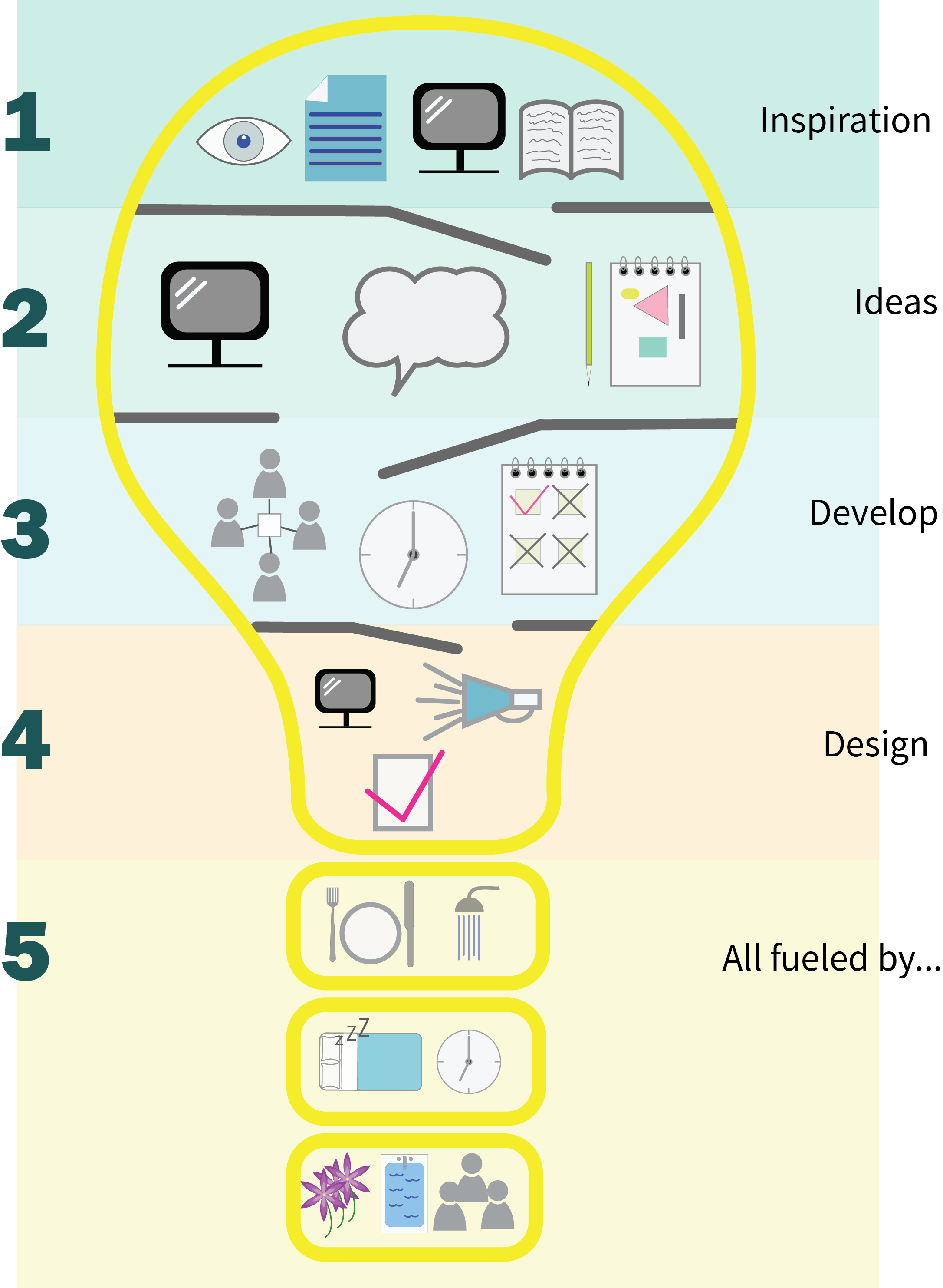
My Creative Process Infographic
It may not be a perfect infographic, and I am finding myself having to resist the urge to explain all the icons but I am quite proud of myself for having got it this far, I created all the icons from scratch and have discovered the joys of the Illustrator Pathfinder tool. The process I went through definitely shows what can happen if you work through your anxieties and just give something a go. Looking at it now I think there are a few things I might revisit like a more consistent stroke weight, but overall I am pleased and a little surprised by the result.


